OW-N Furniture company
Website and branding
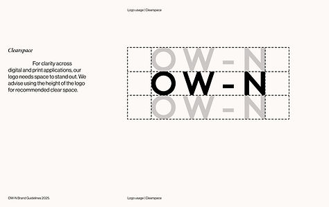
Conductor was approached by OW-N – a furniture design company that sees every piece as both functional and artful – to develop a refreshed brand world and website, utilising their existing logo and brand strategy work.
At the heart of the system is the hyphen used not just as punctuation, but as a design tool to move type across the page, echoing the way furniture is rearranged within a space. This simple device injects flexibility and wit into the brand language. Playful moments surface throughout: a stretched hyphen mimics a coiled phone chord on the Contact Us page, while hand-drawn sketches hint at works-in-progress, grounding the refined identity with the raw energy of design in motion. The result is a brand that feels intelligent, approachable, and something they can truly OW-N.
Agency: Conductor Studio
Creative Director: MJ Jackson
Lead Designer: Harriet Cann
Designer: Holly Roulstone