top of page
The Louies rebrand
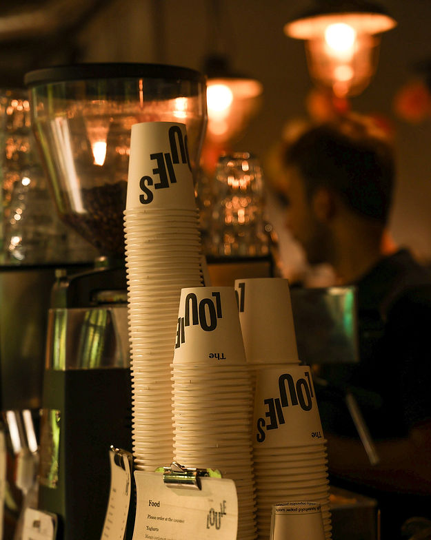
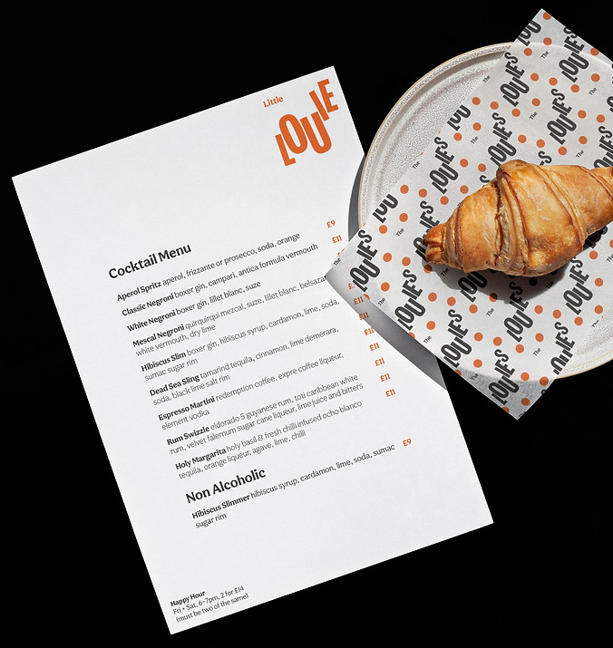
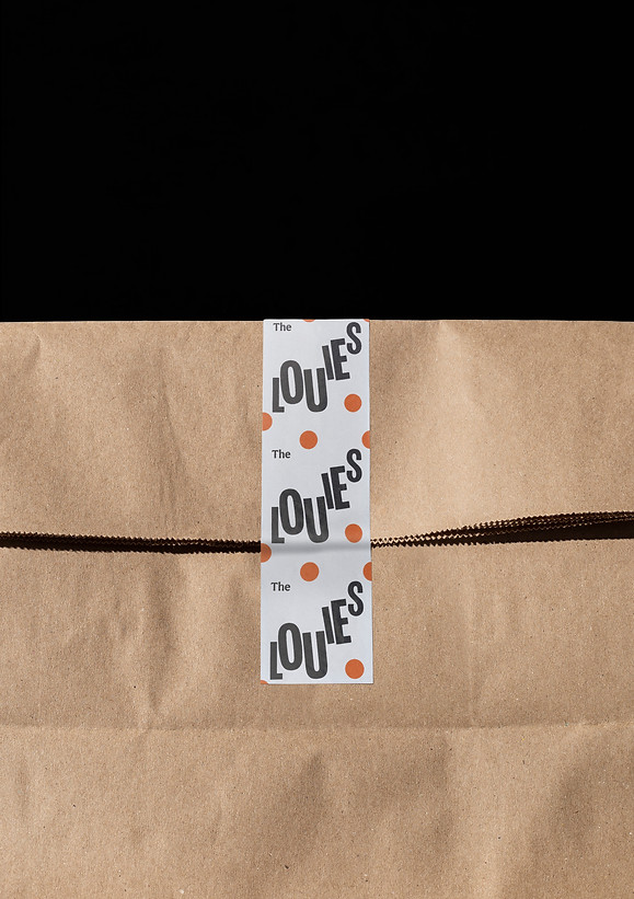
The Louies is a group of cafes based in South London and Margate. Their branches are nestled in existing establishments such as housing developments,
art galleries and a church. They wanted to refresh their brand with a coherent, overarching identity in order to expand their business.
In response I developed a distinctive brand language that represents the playful and energetic nature of the company, while standing out in a crowded field. Drawing from the cafes' vintage decor, the branding takes visual cues from mid-century modern design - an era of optimism and jois de vivre. The logo encompasses the energy and vibrancy of the cafes' diverse communities, with an upward trajectory evoking a theme of buoyancy and joyousness that weaves through all of the brand applications.
Due to the nature of the business, I developed a clean layout system and a series of templates for menus, posters, store signage and social that could be easily implemented by the wider team.
Design, creative direction, motion design,
logo design


bottom of page